Methusalem hat geschrieben:
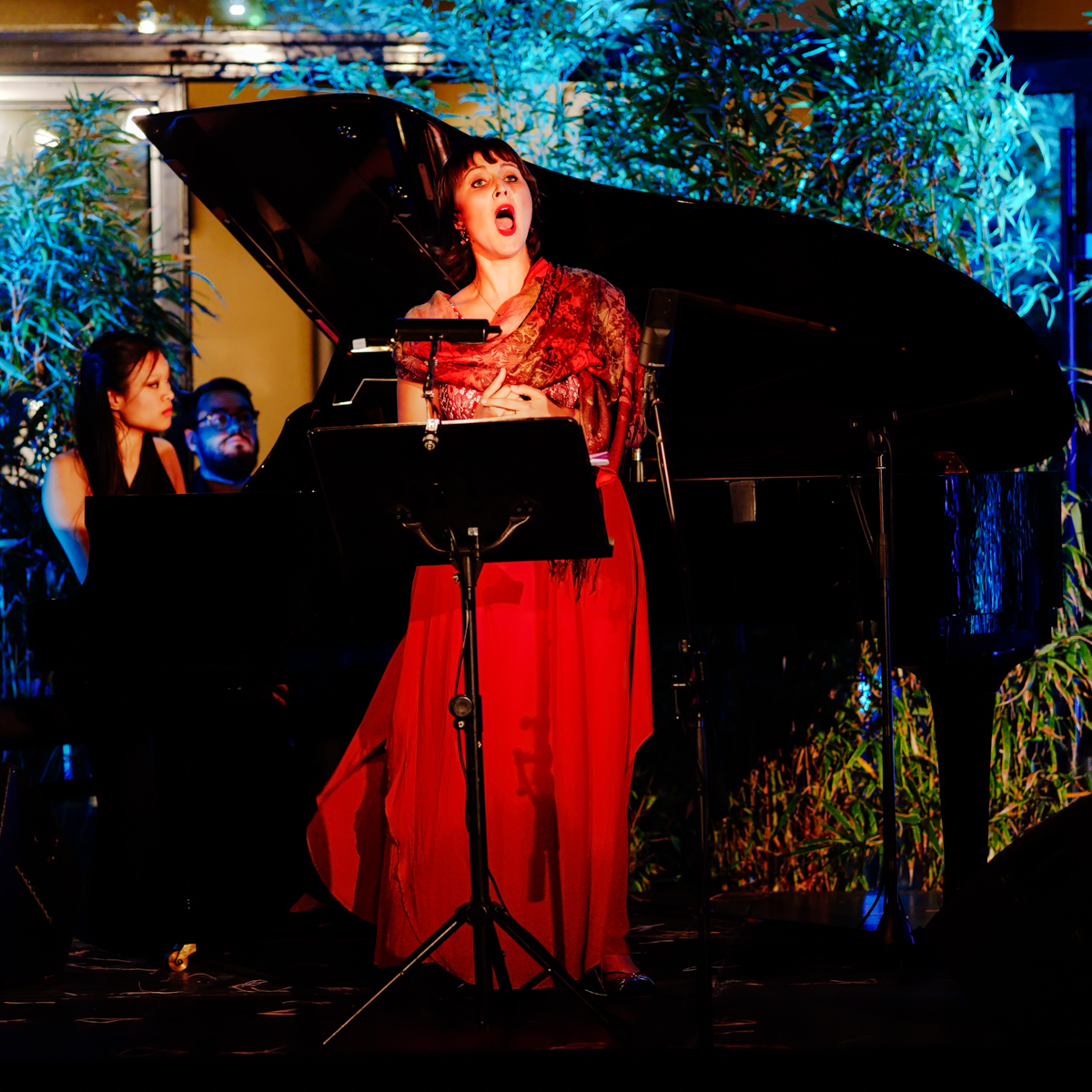
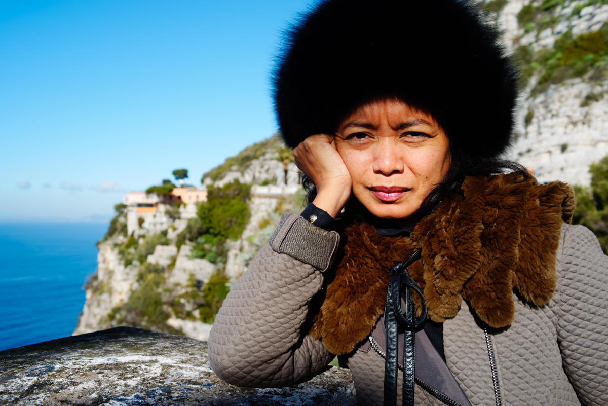
Hi teiki,.....I prefere the B+W Version!,...the colour Version is a little bit too much saturation for me,...and too much of contrast.
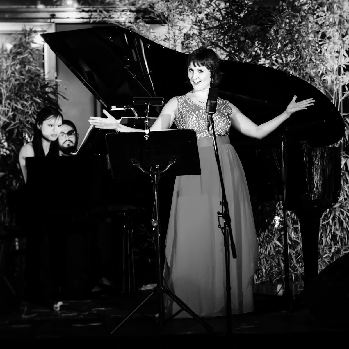
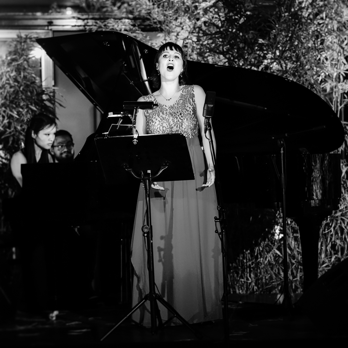
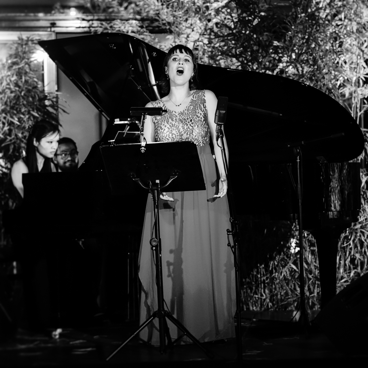
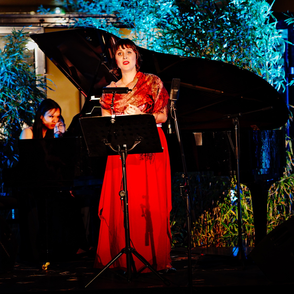
...I think you loose the fine Greytones in the bottom,...and I see this problem in the B+W version too.The Clothes of the Lady are in "one" tone,
it's light grey and only black for me on my monitor.
Your other Pics in the past are very Ok for me

,...but this Pictures don't work for me in a good way.
I don't think your problem ist the iso of 1600,...in this genre with the 90mm Asph Leica!!! ...and the K1 !!! .......

...it's a wonderful Combination,...it works perfekt in this way

I hope you can understand my comment,..it's only my thinking

Bernd
Hi Bernd,
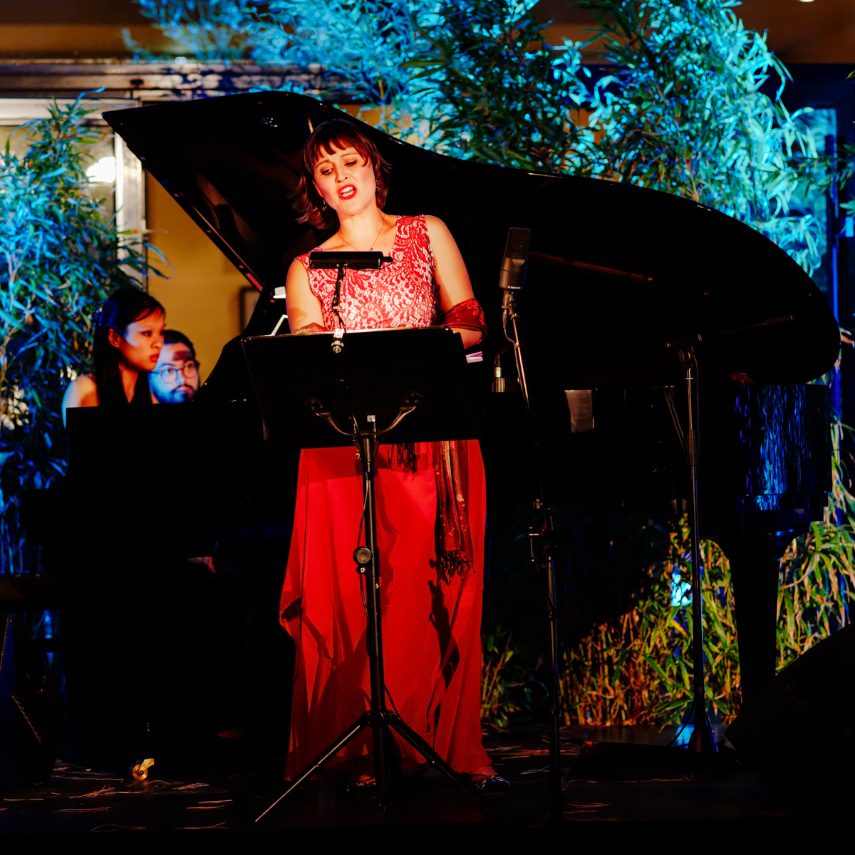
the rendering about color version is slide alike. But the real version is much more contrasted!
The Black & White version is quite different.I wanted it to be grey, like vintage old style.
But I completely agree with your comments. I am not upset at all as your criticism is constructive and always "le bienvenu".
Best regards.
PS:
I live near Perpignan where "Visa pour l'Image" occurs every year. I am a very fan of the first hours. As night turns into day, I am less impressed by the pictures which show a lot of details in the shadows where "flat" light is pervasive. This process affects, to my eyes, the "natural" rendering, distorting the balance between highlights and shadows. That is why I tried to turn color version to a semblance of slide era alike.
I am less motivated by details than by the light.
Thank you for reading.
RE-EDIT: