Roses
So 4. Mär 2018, 09:22
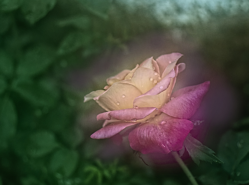
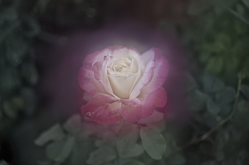
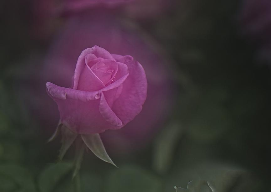
These are from a recent flowers exhibition held in Mumbai, India.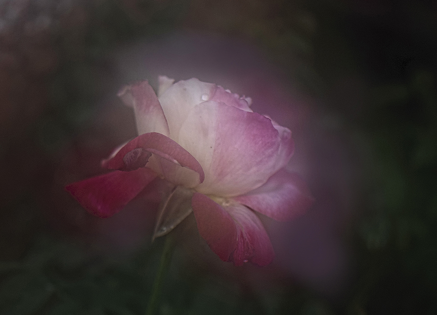
Re: Roses
Di 6. Mär 2018, 20:57
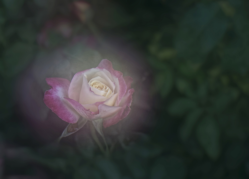
Die pastellähnliche Bearbeitung passt zu dieser Blumenart. Nummer 2 und 5 sind für mich die schönsten. Bei der Nummer 2 gefällt mir der nicht so dunkle Hintergrund und die Aufnahme von der Seite. Nummer 3 und Nummer 5 passen zur ganz dunklen Hintergrundvignette besser, da es weiße Blüten sind. Die Anordnung der Blume bei 5 ist für mich harmonischer.
VG Holger
The pastell-like development in the near of flower is convenient for this kind of flower (rose). No 2 and 5 for me the most likely. On No. 2 is the background not so dim. In No 2 is also good for me the view from flank. Because of the white centre of the flower, are Numbers 3 and 5 also nice in relation to the dark vignette of background. The placement of flower is in my opinion in 5 better as in 3.
Sincerly Holger
(P.S. Sorry for my English, I don't need it since 35 years.)
Re: Roses
Di 6. Mär 2018, 21:02
The aura/ glow around the roses looks a bit unnatural from my point of view.
Did you do it in post processing?
Did you do it in post processing?
Re: Roses
Mi 7. Mär 2018, 06:43
Thank you, Holger for your appreciation and considered views which would help me improve.
Thanks, LX MX for your observations. Yes, it was done in pp.
Thanks, LX MX for your observations. Yes, it was done in pp.
Hosted by iphpbb3.com
Impressum | Datenschutz